Sonos S2 App Design Rethink
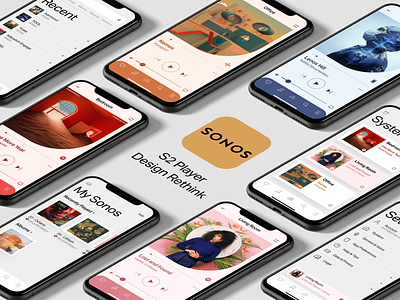
Sonos released last month the latest version of their controller app called S2. I was excited to see what they would do with the design, it's been long overdue for an overhaul. I've been a long time user and owner of a complete Sonos home system (even using one of their speakers for way better TV sound). After downloading and changing my system over to the S2 system, I was a little disappointed. I realize there is a lot going on in the app under the hood for enhancing sound and obviously, for a sound product this is important, but I did not feel it raised the bar as much as I had hoped design-wise. So I tinkered around a little to envision what I thought it could look like and function. A lot of it is light updates, and some a little deeper. I'm no stranger to this exercise as I did this when I first purchased my first Sonos products 6 years ago and envisioned a redesign back then.
So here were my main thoughts surrounding my redesign of the app:
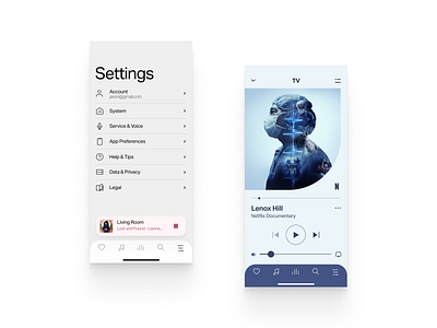
1. Type: Sonos has a beautiful website that embodies its brand so well. The use of typography is bold and evokes a strong feeling throughout the whole site. So I brought that thinking into the app, mainly on the section headers to make them bold and have a strong feel.
2. The player controller: This is largely the screen people will encounter most or spend a lot of time on. Functionality wise, I did not change anything huge here, because UX wise it works and functions as expected. We all know though that a player evokes emotion and feel (look at how many music player screens have been done on dribbble) and I think this screen could be more appealing and step a little outside the standard view of the boxed-in artwork (it also open up an area to move up the service logo to the right to lighten up ). The colors on the current app feel a bit dingy. How about sampling the color of the album artwork through code and expanding that a step further with a lighter background and then also with the color sampling affect the UI as well as the tab bar color to pull out the colors further and create interest and push a softer feeling.
3. Colors: As already discussed on the colors for the player view above, the current gray color being used is a bit dark. I opted for something a bit lighter to contrast the screen type.
4. Consistency: The rest was just leveling things out with consistency with icons (solid vs outline) and also icon line stroke consistency etc.
Take a look at all the screens including one that puts my new thoughts to the existing screens for comparison.
This was a fun exercise for me, and I hope some of my thoughts/decisions come to the forefront as to my intentions of the exercise, allow Sonos to strengthen the brand of their product, and layer some nice aesthetics over their wonderful sound functionality. Respect to their team and continuing to push the product!


