Notes Mockup (OS X)

This is how I think Notes.app should have looked in Mavericks.
What I did to change it:
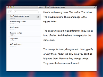
I removed the unnecessary, and ugly beige crumpled paper texture. There was no reason for this, and it didn't even match the icon.
I enlarged the font to be 18pt. Most notes are very brief. There's almost no reason you wouldn't want a nice, large font. A lot of times, Notes may be used to keep open while you're doing something. Say you're using your Mac for a recipe, you don't have to lean in as close to see the recipe. Also, Notes may often be shown to other people looking at your screen. If there are two people looking at the same screen at the same time, neither are going to be able to get in close. A larger font makes sense. I chose Avenir as the typeface for the note. This is what Keynote is using in presenter notes. It feels modern, without feeling out of place.
I moved the new note and share buttons to better locations. Previously, they sat at the bottom of the note view. This causes many issues. The note is unable to fill the entire space and a fade is introduced so that the buttons are visible, even when text is beneath it. Because of the fade, it isn't always entirely obvious when things are scrollable. Text may not appear clipped, but be beneath the toolbar. It's bizarre. Adding a new note also has nothing to do with the current note. Why does it appear there? If I were looking to create a new note, I would first look to the list of notes, because that is where the new one would appear. I moved the "+" button to the top of the list view. It appears on the left since any button that appears immediately to the right of a search field can often be seen as a "go" button, even though it isn't.
Since the bottom toolbar from the note view was removed, the share button also needed to move. I thought the share button made more sense in the notes list view anyways. Not only does this make more sense, but it also allows you to hover over other notes and be able to share them, without even having to open them. This saves you the trouble of moving your cursor over to the list, clicking an item, moving your cursor back to the corner to share an item, then back to the note that you were previously on.


