Overtone Brand Wordmark


More from the uninvited redesign of one of my favorite products, Overtone.
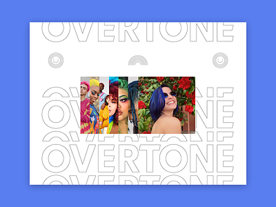
The custom wordmark is all about that look good / feel good dichotomy, and accurately representing who you are from the inside out.
The back layer of the wordmark represents the emotional side of you — your "inner self".
The front layer represents the physical side of you — your external appearance that translates your emotional side to the material world.
For those that are not familiar with Overtone, it is a hair-healthy, color-depositing conditioner that launched in 2014. We felt Overtone deserved a brand refresh.
Here you get a sneak peak of some icons I designed for the brand, as well as the photography style and treatment. More to come on those!
🌈
Check out the full design study at ds.link/overtone


