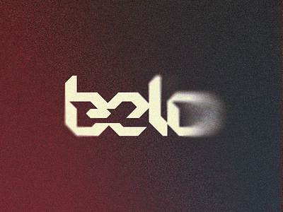
B-elo (link) // Chiseled Shadow 15/15 - Logolounge 2020 ⠀

Trend Report // Logo Exercise ⠀
⠀
Belo is a word for beautiful in Brazilian Portuguese, also a play with "elo" that means 'bond, link'. I think you see what I did here, let me know what do you people think of this concept. This trend is pretty simple in terms of tecnique, so I tried a more complex idea behind it, don't know if worked nicely.
⠀
Feel free for give me some feedback, concept is clear enough? What do you people think? Would be nice to hear what you see on this idea :)
This side-project was meant to be an exercise on the logo trends of the year. As I've said on the previous posts, my motivation is just to study the trends and hopefully create interesting concepts using it as platform, experience some new styles, etc. I hope you enjoy this project with me (feel free for check the 1, 2, 3, 4, 5, 6, 7, 8, 9, 10, 11, 12, 13 and (yaaaay, done) 14)!
⠀
Plus, I've decided to work on a fictional logo concept for each of the sections created for the Logolounge 2020 Trend Report.
So I'm excited to try this new stuff and hope you people are enjoying this quick journey with me as well! ⠀
⠀
Let me know what you think about this work, bro :)
Your feedback is really highly appreciated! ⠀
⠀
The description of the trend I'm following on this shot is above, I'd love to keep the discussion on this topic flow so here goes the text: ⠀
⠀
"Demonstrating dimensionality of form is a foundational way of shifting a flat image from 2nd, to at least 3rd gear. Finding that hybrid between committing to gradient tone and graphic surfaces that imbue reality and a simple vector outline really only offers up a handful of tricks. Shadow has long been a staple of the designer to convey space in a flat graphic. They are less about the absence of light than they are about defining a light source. Harsh shadows on these marks can help to communicate a client’s desire to be under the focus of a spotlight and open for complete inspection with nothing to hide.
What differentiate this group from other shadow marks are the 45-degree angular cuts that would ordinarily be cast if the surface it appears on is a separate plain angling away. This is modestly troublesome in trying to actually model the realism of the light conditions. I’m convinced these designs are less about crafting reality than they are about creating a dramatic fictional dimension, embellished by stark shadows with flexible rules. The mass appearance of this effect is mostly played out on sans serif letterforms and tends to hearken to the angled effect of a serif, excised from the letters in a chiseled dimensional form." ⠀
⠀
(article excerpt by Bill Gardner) ⠀


