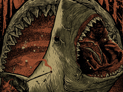
"Jaws" Sep/2013


Happy new year yo!
Last year's work, had to hold it until it was released.
I particularly like the linework of this one, but think it could be better.
The original version consisted of a minimalist typography at the bottom, flowing with the anchor and giving more space to the jawbone to avoid the "box" feeling.
The final version was requested by the client to give more "punch" to the name.
3 colors on black garment.


