Rho AI Brand Playbook

Rho AI was happy with their logo. What they were not so pleased with was managing the brand of their rapidly growing artificial intelligence firm. They came to me to help establish a brand around their logo and document it via a brand playbook PDF.
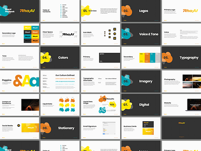
The identity up to this point was grey and black with inconsistent iconography and no photography.
They are a team of incredibly lovely people. After the requirements meeting, it was apparent they needed bright colors that reflect the group dynamics. I also thought about the perception of data, the applications, and limitations. Rho AI finds increasingly creative ways to apply, shape, and color data to help executives better run their business. They see data as limitless and get excited about the possibilities.
All of that made me think about abstract liquid shapes. The logo is a gradient from yellow to orange, so those are clearly in play. I landed on teal to compliment. A also moved the black to dark grey to tame the bright colors.
The typeface it Poppins. I like how the bold weight complements the large shapes. Combined with the colors, this gives them many ways to use type to tell stories, convey ideas about data is a way that stands out.


