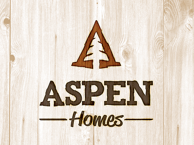
Aspen Homes Logo
Aspen Homes re-brand project was created to assist my client in celebrating 20 Years of Quality Custom Homes. It was also designed to help create a solid brand for their very reputable business in the area since they had 5 different logos representing their company before.
The design was created with imperfect lines to help emphasize their rustic and distressed design style w/ dark woods, and mountainous accents. The "A" mark was design w/ a pine tree in the negative space of the "A" to communicate the mountains, and outdoors lifestyle of North Idaho. The "A" is also design in such a way that it can be applied to collateral on its own at a -15 or 15 degree angle to help anchor the company's brand throughout the area.
Overall the design is applied with a burnt wood effect which is used in stationary, signage, web and other elements.
See more on this rebrand at:
https://www.behance.net/gallery/14530779/Aspen-Homes-Re-Brand


