Banker's Hours Beer Label Lettering & Design

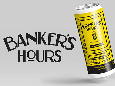


Who doesn't want to work banker's hours? In at 10. Out at two. It's a tough gig but somebody's gotta do it. And surely that somebody gets thirsty. Enter this tasty amber lager from my pals at Pathlight Brewing.
The style I chose is a basic sans serif Art Deco type. No frills, but the letters are tight as a big banker's bowtie. I placed the top letters on an arc to allow for some slight hierarchy in the layout.


