Nyerver Landingpage Header


Hi guys,
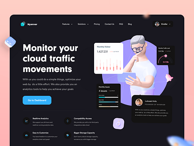
Just wanna share some exploration in the hero section. I decide to use a contrast color alongside dark background it gives the emphasis and readability better.
Please let me know what do you think about this exploration!
Also, feel free to feedback and comment. don't forget to press "L" if you love it. Thanks!
Big thanks for Anton Mishin - Kukla 3d icon kit for creating this awesome illustrations.
Connect with us: owwstudio@gmail.com


