Public transport - Realtime stops, lines and rides (De Lijn)

One of my biggest challenges working for public transportation companies in Belgium was convincing them that transparency was key to improve user satisfaction about their brand and that their core data such as when a bus will leave, where it will drive, what deviations it has, etc is the most important aspect for their user.
Step 1
Before, delays and early departures of the bus weren't shown. Trams that were cancelled would be show to appear. Only half of their fleet was transmitting accurate gps signal for realtime data. It was a disaster. After some hard work with various other UX designers, developers and product owners, we managed to improve the overall availability and quality of the data shown. We've also made it possible to finally see the cancelled busses and we designed a solution that could tell if the bus was too early or would be too late. We've also introduced some new statuses which tell the traveler that the bus is nearing the stop, is at the stop and is departed. Finally some transparancy!
Step 2
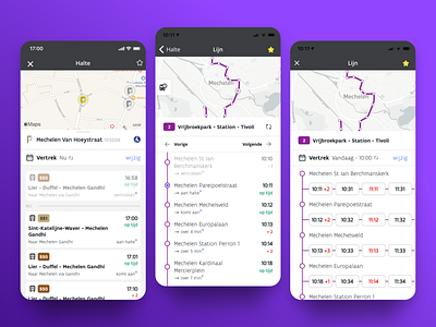
The layout was a mess. Everything was shown in minutes ("Your bus will arrive in 89 minutes"). Great for city users with a high frequency, yet not so great for transportation in remote areas or when people rely on the bus that departs at a specific hour. People could already plan their journey, but it wasn't really easy to look at the departures of their nearby bus stop. Others preferred to have a timetable of that bus line while other simply wished to see that specific ride.
So that's exactly what we did and what you can see on the shot, we made sure you can easily look at the departures from your stop as well as a timetable of your bus line and the details of a specific journey. Since there are different types of travelers (certain & uncertain) which have different needs, desires and preferences, I designed these elements to contain both preferences (minutes vs hour) and transparant data (delays, cancellations, etc) to serve this broad audience.
Step 3
Thought we were done? Nope. People are visual creatures and being able to see where a stop or bus is makes total sense to make it all extra clear. So now, they can finally orient themselves from the detail views they prefer.
---
The showcased design was made by understanding various user needs and frustrations which we gathered and researched and has been validated (and further optimized) based on feedback from our beta testers and various surveys and user test we conducted.
---
Want to see it live?
🍎 iOS | https://apps.apple.com/be/app/de-lijn/id456910787?l=nl
🤖 Android | https://play.google.com/store/apps/details?id=com.themobilecompany.delijn&hl=en
If you like what you see, don't hesitate to follow me ;) I'll be posting more about my work for the Belgium public transport companies and various other experiments! 🎉


