Bing Redesign

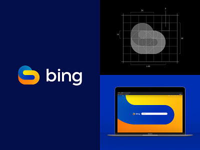
I've never been a fan of the bing logo as it strongly resembles Google Drives appearance. I wanted to find out what would happen if I was given the opportunity to redesign their logo. Something that stood out to me during the research stage was the caption used on the app store "Connecting the dots for you." During my initial sketches, I picked out the concept that portrayed two shapes being connected while sticking to the original bing colours. Excited to see what your thoughts are on this.


