Boba Chatime redesign

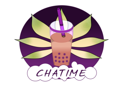
Chatime does a variety of drinks but I really wanted to focus on the boba. I didn't have time to get the spacing perfect but I wanted to add bubbles around the letters to channel the fun feeling of tapioca pearls. I wanted to keep their leaf from their logo but used the spread out tapioca leaf to keep that green in there to counterbalance that purple. I considered changing the color palette to something pastel because I find boba to be a drink that's considered cutesy. But I think the intense purple and green chatime use is striking. The outer elements have a bold outline, but at the center cup where the outlines disappear. Boba in the plastic cup tends to be indistinct clusters of color. Another low res piece because it's been a busy week...I want some boba now...


