Victorious


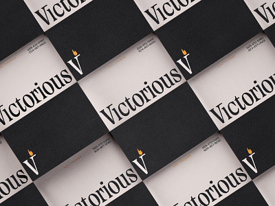

For Victorious, we chose the conceptual thread of torch. We wanted to play off this concept in a number of different ways. First, the logotype borrows the "V" from The Pyte Foundry's Errata, a typeface we felt has a ton of character to it, but also felt reliable and trustworthy.
Problem is, Errata only comes in uppercase. So we imagined what Ellmer Stefan would have built (to a lesser degree of course - the dude is a magician!) the lowercase to look like. We finished out the rest of the custom logotype and paired it with a monogram counterpart that held the flame that would act as a perpetual symbol for Victorious.
For the business cards here, we wanted the "Vi" ligature and the torch monogram to sit in the exact spot on each side of the card. On the dark side, it lights the way, and on the opposite side, the path is clear.
We explored a ton of custom type for this project, so there's more to come!
---
Looking for a brand agency? We would love to hear from you. Email us: hello@focuslabllc.com.


