Jacksonville Jaguars

I fell into a rabbit hole last week and decided to take a crack at redesigning the visual identity for the Jacksonville Jaguars.
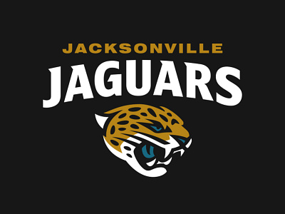
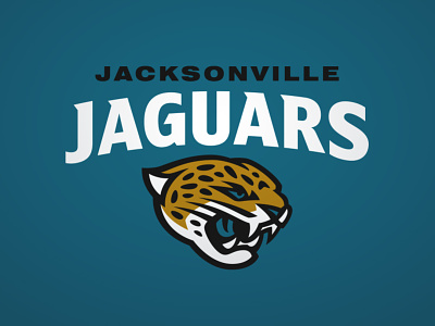
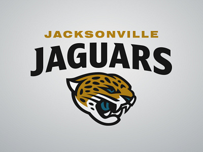
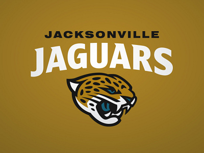
Taking another look at the two primary logos and my initial concept., I wanted to start anew and skip the band-aid approach. While the current logo is a better anatomical representation of a jaguar than the previous, it lacks the traditional sports aesthetic that has been proven to be effective. This newest concept now captures the essence of the beast while wrapped in a way that balances detail and durability.
I took a crack at a custom wordmark, too. To better understand the creation of the current typeface, I read through an interview with the NIKE Creative Director of Football from May 2013. A certain perception stuck out to me, specifically the idea behind the typeface that likens it’s jagged and angular approach to be “characteristic of the jaguar”. It’s my humble belief that sharp angles and jagged edges are quite the opposite of the jaguar. These creatures are fluid and stealthy, and I worked to implement this into the wordmark.


