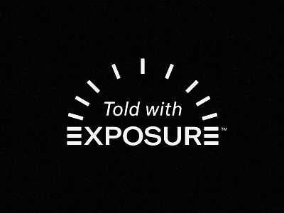
Told with Exposure
This was a killed take of a recent logo gig but I loved it so much so it can live here for now. Hopefully we'll toss it on a tee shirt or hat somewhere down the line.
It's so rare that you get the same letter at the beginning and the end of a logo/wordmark. I was convinced that there was a way to tie them together and this is what came out. Exposure is a storytelling CMS where people can share photos from all over the world in a beautiful way so I wanted to nod to that in some way or another. The idea is that the E's and the arched ticks are supposed to represent the exposure dial on your camera. It also feels like sun/light rays which play a major part in developing photos IRL. Leaning VERY HARD into the vintage camera brand vibes for this one, super amped on it.


