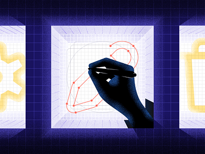
Fundamentals of Icon Design
Wrote something for the MetaLab blog!
“Icons are like microcosms of a product or a brand. Through what they depict and how, you can glean a lot about a product, how it functions, and how interacting with it might make you feel. So why isn't more care given to icons? A lot of products treat them as an afterthought, and sometimes don't change at all from wireframes through final deliverables. Now not every project calls for custom icon work. But relying on stock icons is the same as relying on stock photography; it might functionally do the job, but it's generic, unownable, and doesn't speak to a brand/product's particular strengths & quirks. This is also where you can really let an app's personality really shine!
A fantastic opportunity to do just that arose earlier this year with Indigo, a fast-growing startup that brings Silicon Valley tech into the world of agriculture. Their existing marketplace connects farmers and buyers, and we partnered with them to expand that experience to mobile.”


