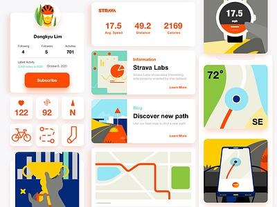
Following brand guideline, exercising interface design
As a cycle lover, I have been using the Strava app since 2015 while I'm cycling. This time, I saw dribbble's weekly warm up page and it was designing favorite iOS 14 home widget and I decided to create Strava widgets for iOS homescreen.
To do this, I saw Strava's brand guidelines. Their brand colors, typography, photography, and illustration guidelines. It is great exercising by following their guidelines while I was creating the illustrations. Strava has very clear directions on their PDF file with some examples. This helped me a lot to understand the look and feel of their illustration style.
As I'm more focusing on illustration, rather than UI design, it is always challenging to create an interface. I wanted to have a clean, minimal interface to emphasize bold and colorful illustrations.
Thank you for seeing this and please give me some feedback if you have. :)


