Brand Refresh - Before and After

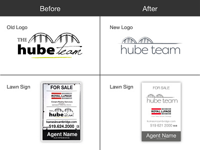
The old logo served them well for many years but it was time to freshen things up. I went with a simplified version of their bridge mark and a single font compared to a mix of three fonts in the old design. Every application the logo would be placed upon was also cleaned up and simplified as much as possible. Really happy with the update and how it turned out.


