Onboarding UX flow redesign - Zelos

This redesign of Zelos' onboarding flow is one of many initiatives seeking to increase user retention. After seeing high day-1 dropoff rates, I decided to focus on first impressions. Complicated UI on any website can be a source of frustration that prevents new users from returning. In combination with overly detailed and text-heavy onboarding flow, new Zelos users were likely to be confronted with steep learning curve after signup.
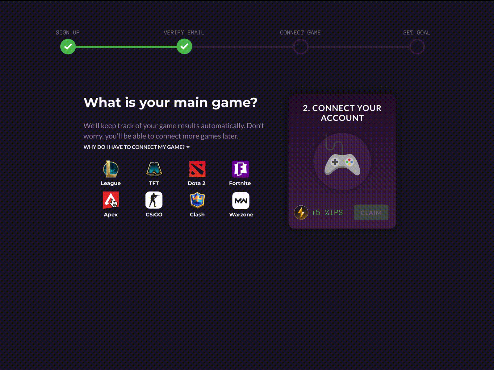
My overarching goal in this redesign was to minimize confusion and prevent new users from feeling overwhelmed after signup. Specifically, I aimed for: 1) simplicity, 2), communicating the value of Zelos, and 3) familiarity with the mechanics of the site.
Rather than giving users a tour of Zelos' features and risking information overload, I kept it minimal with a typical signup flow and clear CTAs (goal #1). However, there's a twist. Zelos is a rewards site for gamers that allows users to earn points by completing certain tasks. This onboarding design familiarizes users with the core components of the Zelos experience by simulating "Missions" and "Claims", but using the onboarding steps themselves as tasks to win rewards! Allowing users to earn points as soon as they sign up, in a similar fashion to how they would on the actual site, knocks out goals #2 and #3 in one go.
By giving gamers a taste of what it's like to win rewards on Zelos, implementation of this redesign increased day-7 retention by 8%!


