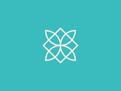
Destination Connection Logomark
Destination Connection is a destination management and lifestyle company catering to the discerning traveler. Their goal is to ensure their clients relax, unwind, and connect with Barbados.
As a luxury management company, the objective was to portray sophistication in their identity. The line art styled logomark forms a diamond and flower - it may even form a D and C depending on how you look at it. This combination symbolizes the quality, sophistication, and superiority that is personified by the company.
Client: Destination Connection
Deliverables: Brand Identity
Location: St. James, Barbados
Created: July 2018
See the full case study: Destination Connection
View all tags
Posted on
Nov 15, 2020
More by Dominic Skeete View profile
Like


