Grafted - Logo Design v3 🌱

Grafted - Logo Design🌱
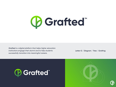
Grafted is a digital platform that helps higher education institutions engage their alumni and to help students successfully transition into meaningful careers.
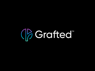
Been playing around with a more sleep direction and used a more thin line to capture the essence of Grafted. These thin and futuristic colored lines would potentially suit the brand very well. As these color suggestions came from my client directly, it might be a perfect match.
Concept:
- Tree
- Diagram
- Grafting (trunk junction)
Thank you very much for the valuable feedback on the previous two posts! Curious to hear what you think of this direction.
Currently open to hear your feedback.
Interested in working with me?
I'm currently open for new freelance opportunities: