


Nonprofit Yoga School Final Logo

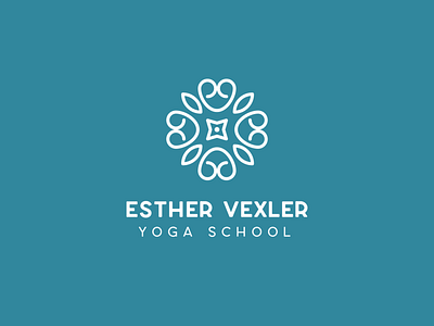
Although my client loved the initial concept, after some thought her organization decided they wanted to differentiate themselves from the bright talavera style that's so integral to their Texas community. We kept much of the typography but swapped the logo for something clean and simple, with elements that represent compassion and growth. The central four-pointed star shape of the logo represents the inner compass their students follow as they engage in their training programs.


