Booking.com Mobile UI Redesign

Please vote for us here...
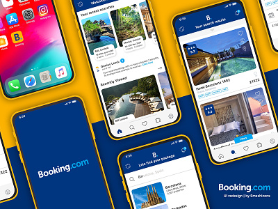
Uplabs Booking.com redesign Challenge
My first Uplabs challenge and really enjoyed it. It was super fun to download and use the existing app and analyse the various elements that could be improved upon. On the whole, I felt like the UI was overcomplicated and seemed like the app developers had simply bolted on functions throughout its lifetime rather than seamlessly integrating them into a cohesive User friendly design. I opted for a simplified design that could integrate the current functions in a more User friendly Experience. Following recent UI trends I went with the bottom NAV which holds all the most used functions of the APP. All icons used in this project are part of the 24px icon style available for free at Smashicons
Smashicons | Instagram | Linkedin | Facebook


