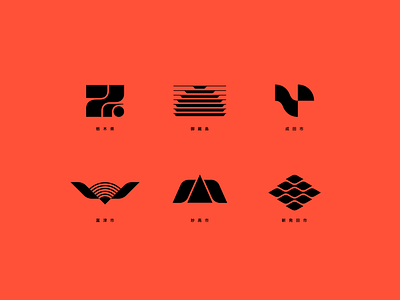
Japanese prefecture logos
Redesigned some Japanese ward and city logos in a modernist style (the beton brut equivalent for logos?). From top-left: Tochigi, Mikurajima, Narita, Futtsu, Myōkō, Shibata.
After spending some time in Japan now, this style strikes me as uniquely Japanese — it has a tad of a retro-futuristic / nostalgic note, but also a bit of a "big corporation" vibe with it's cold geometric rendering.
More by geometrieva View profile
Like


