


The Good Food Company | Logo Exploration

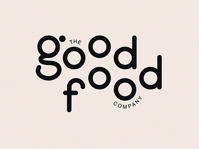
I saw this branding of Charly Tudor for The Good Life store and I instantly thought about the magazine "Good Food". I just wanted to try my version of his idea of the dislocated floating type.
I love how "Good" and "Food" fit nicely due to the repetition of "ood". I imagined that this logo could be used by an online grocery store as they are quite popular (and needed) lately. I also imagined that it would focus on farm-locally-produced food. Hence "good food". I then rounded the corners to give it a more friendly vibe.
I liked my version a lot so I decided to share it. I didn't create it for a client but for a little practice for myself.
Check out his case study on his website to see the differences. https://charlytdesign.com/work/thegoodlife


