


The Good Food Company | Logo Exploration

I saw this branding of Charly Tudor for The Good Life store and I instantly thought about the magazine "Good Food". I just wanted to try my version of his idea of the dislocated floating type.
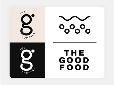
You may see in my previous post that I tried out a version of mine of the logo, then I decided to create symbols, a smaller glyph logo and a stamp as for a real use case.
I liked my version a lot so I decided to share it. I didn't create it for a client but for a little practice for myself.
Check out his case study on his website. https://charlytdesign.com/work/thegoodlife


