Signal Messaging App Logo Mark Redesign


After the recent events, Signal messaging app became extremely popular. The current logo is nice, but I believe it needs an update for multiple reasons. Let me detail you my thoughts on the current logo:
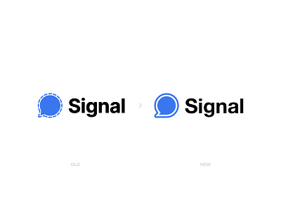
1- The chat bubble icon in the middle is exactly the same as WhatsApp's chat icon. It needs to change.
2- The outer later around the chat bubble icon is a dashed line. They wanted to emphasize the security layer around your chat, but as its dashed, it also reminds me that the app does not 100% secure my chat. There are still gaps that anybody can slip inside..
So first of all, I updated the chat bubble inside with a much minimal version.. And much different that the WhatsApp's icon :) Second, I added a solid thick layer around the chat bubble referring that your chat will ALWAYS be secure from outer attacks, NO gaps allow outsiders to reach your conversations..
So what do you think? Please tell me your honest opinions about the design.. They help alot and I read them all.. And also do you plan to switch Signal?
Please Hit " L " if you liked my work, helps alot 🙏🏻 Thank you for your support..
------------
http://www.designermurat.com
hello@designermurat.com
Need a new logo design? Email me or visit my website to see all pricing and packages I am offering in detail..


