🏠 Auditi Homepage - Comparison table


Hej folks 👋
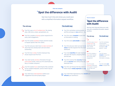
This section of the Auditi website is comparing the conventional way of making audits with the new "Auditi" way. These dot-formations have the duty to give the reader a rough understanding about the differences without actually having to read it.
No possible icons or images could transport these messages in such a subtle and effective way. Simply using dots instead offered the possibility to translate various different meanings.
Designing this section was one of the most challenging. But as you may all have experienced by yourself, the most challenging often turn out to be the most satisfying when solved.
This idea was inspired by a dot-based animation video of an apple-keynote a few years ago.
Please leave a comment and tell me what you think! ☺️
_________________________
If you’re looking for a strong partner to design your web/mobile application or website feel free to write us: hey@whitespace.cc
We’re always open for new projects and great companies to work with!


