Fuel Up Logo Design

Logo design for Fuel Up by Tiff & Erika
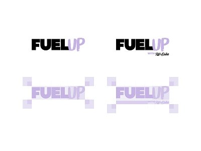
The brand identity for Fuel Up is inspired directly by the personalities of its owners. The tone is unique, feminine, and rebellious—a combination of hard and soft.
The logo is inspired by bold, extended auto-industry type; a nod to the word ‘fuel’ in the brand name. This type style is typically considered ‘masculine,’ so using it in a feminine brand plays to the rebellious tone of Fuel Up.
Other shots from this project: https://dribbble.com/oakleycreates


