Stamford Distribution Logo

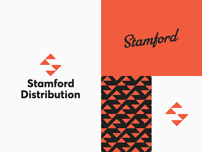
An extreme minimalist take on branding for a shipping and distribution company. The logomark is comprised of directional arrows while an S monogram exists in the negative space. The classic and somewhat retro aesthetic lends itself to the no-nonsense attitude of the business and its owner.


