Heat map table

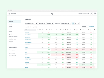
This heat map table lets restaurant groups know the performance of all their restaurants, based on their reviews, seated diners, guest spend and more.
The heat map colors help users know at a glance where they should be paying attention to.
This was done way back in 2020, but is still used thoroughly by restaurant groups and worth a dribbble share!


