Navigation Menu: Redesign

Exploring a redesign concept of the Air & Space Magazine navigation menu.
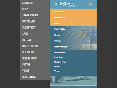
The current menu (left) is what is live on the current iteration of their website. In my opinion, there is a lack of hierarchy and differentiation found in the current menu for mobile devices. The current concept I am exploring (right) aims to introduce hierarchy through the use of color and imagery.
I would like to improve upon my skills in regards to designing for the web as well as UI/UX, so with that said any and all comments will be appreciated.


