Logo icon ideas alternatives

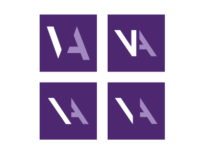
Working on a logo for a new client. And I was working on an icon to be part of the logo (potentially). I'm not sure which I prefer. The client is an architect, so i'm leaning towards to the use of avant grade as the icon. I wanted to break it up a little bit to and make more use of negative space (as they often do in architecture) - so I have broken down the V and A.
Any feedback would be welcome - which do you prefer?


