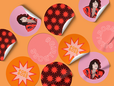
Second Up-close shot of sticker pack

My Process
BRIEF
This project was from the New York Institute of Art and Design online certification course. The brief was to redesign a book of choice and include an analogous color scheme, and create a simulated 3D space. The requirements of this project also involved using 3 or more elements and principles of design. This was the first project of the course.
CHALLENGES
The biggest challenge was creating the illustration. It took up the bulk of the process and then, next to that, a challenge was incorporating the book title into the design after I had created the illustration.
GOALS
The goals for this project was to make it more fun, pop culture-y and illustrative as opposed to the original cover which was a photograph of the author with plain, bold black text titled GIRLBOSS.
UNIQUE SOLUTION
I created a new rebranded font and color guide for the brand ‘Girlboss’. I also remade the book cover design as well as designed some stickers.
I started the project off by creating a moodboard of the type of illustration I wanted to create. I used flat vector shapes and the pen tool to create the image of the author. I created a few changes to the original image- I made her head smaller as an illustrative style choice and also played around with the color palette for her outfit.
Ultimately, we get a fun, even whimsical flat vector design as the front cover and then a sticker-like pattern as the back cover. I also decided to design a few stickers.


