Walkiees logo redesign

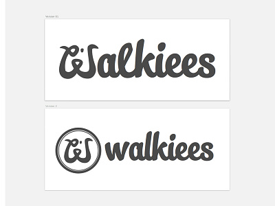
Working on a new logo as part of a full site redesign for my project site, walkiees.co.uk
I've been wanting to do something less obvious than using a paw print!
The 'W' and the rest of the lettering needs some more work and tweaking, but I'm wondering what opinions are on the 1st vs 2nd versions. I'm leaning towards 1.


