UI Tip - The power of red in UI

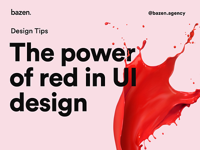


Here is why red is your no.1 color if you want to draw attention ❤️ _ Tip by: @smilence_m _ Red color is often linked with danger, errors and other negative outcomes that can happen if you take some action. However, it's not a rule. It can be a symbol for love, passion, and other strong emotions. What's important is how you use it, and what do you want to achieve with it. No doubt that it's super powerful whether you want to use it for a warning, your brand or for evoking a specific emotion in your users. _ Check these examples and let us know what you think! 😎


