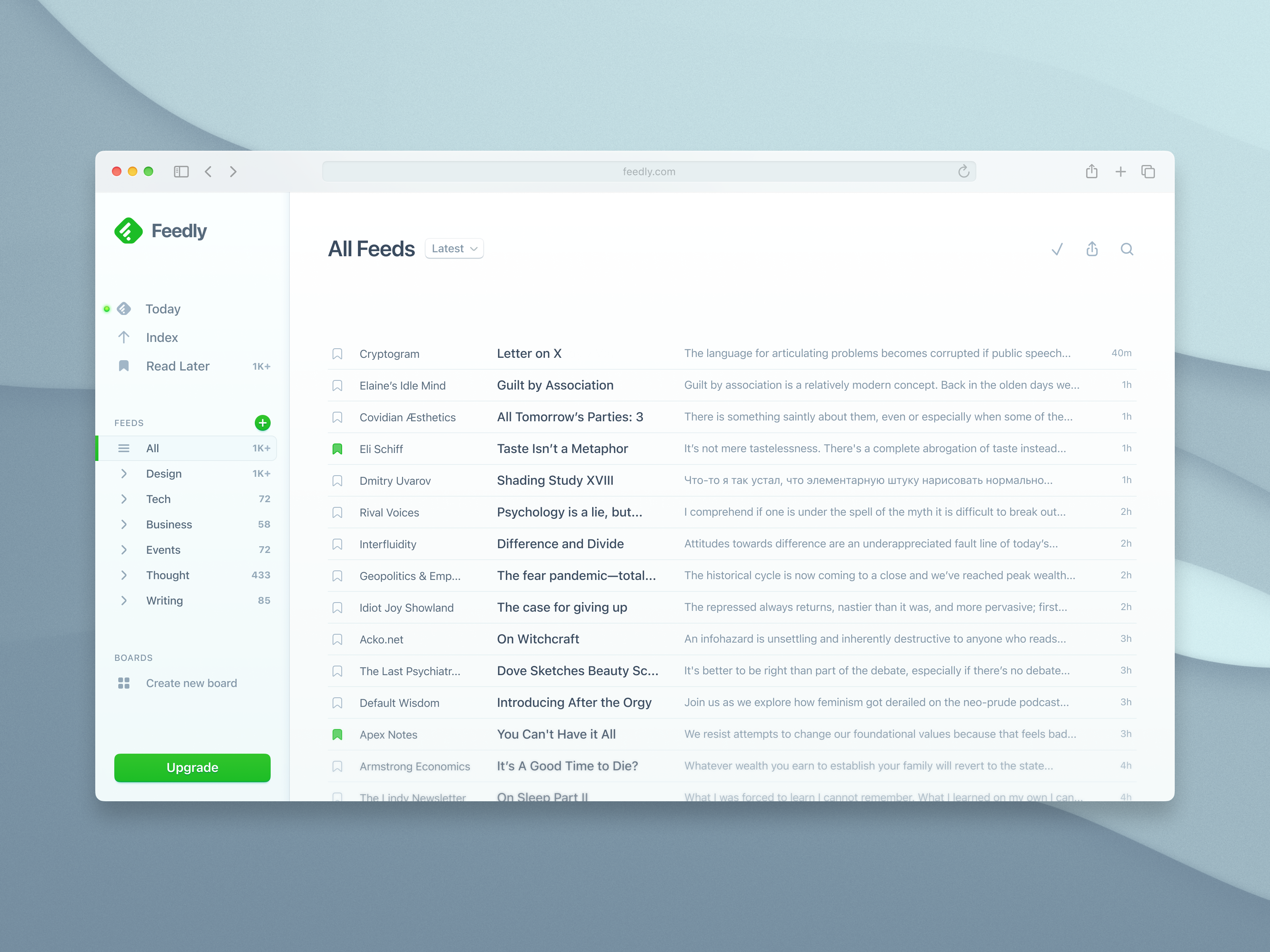
Feedly Redesigned

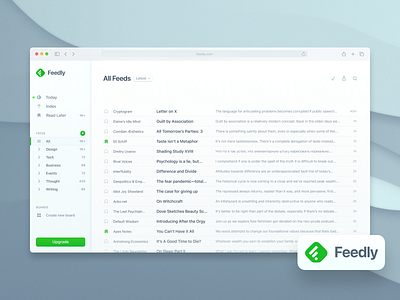
Thinking about what it might look like if Feedly had done a redesign since 2014 or whenever they last touched the design (which basically assumed all the premises of the flat design movement).
I quite like the layout they are using, but it could be much more comfortable to read. Some of the changes:
* New custom icons
* New and more curvaceous logo
* Better alignments and hiearchy
* Improved legibility with larger text-sizes for easy scanning
* Depressed sidebar, emphasizing the main content area
* Tinted shades


