Cape Cod Potato Chips Rebrand Assets

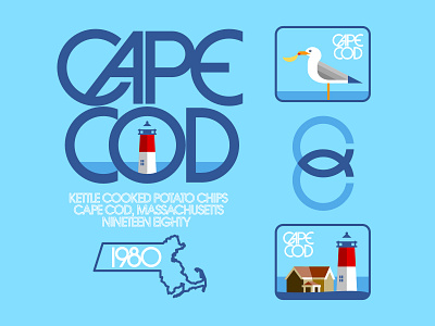
Cape Cod Potato Chips, as tasty as they are, don't have a very interesting identity design in my opinion. I felt like they could use a visual spruce-up, and so I set out to do just that. My type redesign ended up falling in the Lubalin-Retro category for neither the first nor last time, and the rest was designed to fit it.
I reimagined their rather uninspired packaging as well, here's a link to that and a better look at the whole lot on my IG which I promise will be more active in the coming months... https://www.instagram.com/p/CNAytZHpJb0/
I would be thrilled to hear any and all feedback on this project, & feel free to leave a like if you do, Thanks!


