OS X Syrah - Concept


This is my turn at an OS X Syrah (if it will be named this way) mockup. I saw a lot of them recently but very few are good enough to satisfy me.
Here are my thoughts behind this mockup:
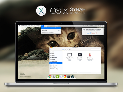
The menu is a translucent gradient just like in current versions of OS X with only one addition: the background blurs like in iOS 7. This gives the user the ability to personalize everything with just a simple wallpaper.
The help menu fades into the menu item and gives the ability to search for topics (I really hade the current double-gradient).
The finder is mostly iOS 7-ified. Please don't judge the filetype icons: I'm not really good at designing such icons... ;)
The dock still is 3D although a bit flatter than before. I like this style and didn't want to change it that much.
Notifications' buttons are easier to reach when they are in a separate row. They also allow for usage of color to distinguish from each other.
Last but not least I also changed the font. Lucida Grande is okay but not great. Myriad Pro allows for more styles for different scenarios while looking generally cleaner. Bonus: Myriad Pro already is a font heavily linked with Apple because of their website. Helvetica Neue does not really fit into that.
Hope you like it and let me know what you think of it or what you expect from the next OS X.
Quick sidenote: Yes, the icons are blurry in the attachment. This is because my MacBook using Sketch did not want to save this large file correctly. I need to upgrade my MacBook... :D


