Tush Toners Brand Identity

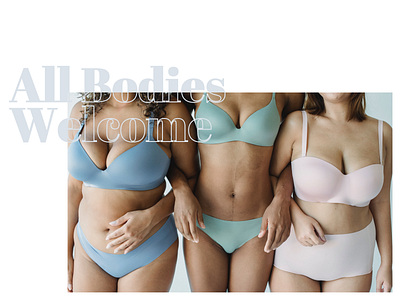


I designed a complete brand identity for Tush Toners, Chicago's premier non-invasive body sculpting studio. The goal was to create a fun and bold brand that was inviting and not intimidating. The brand needed to feel judgement free and welcoming to all body types because of the wide target market. This brand is for anyone and everyone who wants to help expedite their toning, weight loss and cellulite reduction goals.
The logo iconography was created as a play on "before and after" Tush Toners services, with a bold sans-serif wordmark to keep the brand feeling modern. The brand typefaces were selected to keep that modern look, while also tying in a bold and stylized serif font that can be used to add a fun and confident vibe. The color palette consists of a range of blues, evoking feelings of renewal, calm and confidence.
These brand guidelines were applied across business and marketing materials including company stationery, promotional flyers, and the website.


