Payment History Data Charts

There's empty states, and then there's empty-ish states 😅
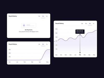
When you've got the current data but no historical data, you need to design for that too.
This dashboard widget is for Panther customers to visualise the data on the total cost of employment they've paid for their remote teams.
About Panther
How remote teams hire anyone, anywhere.
Panther takes care of your teams' global payroll, benefits, taxes, compliance and more — so you don't have to.
www.panther.co


