Mercury Brand_01

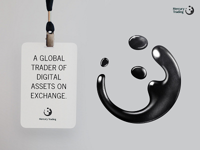


One of three options I've explored for our client Mercury Trading. The goal was to create options that fit their ethos - which is basically "serious play". The liquid shape is a nod to liquid mercury and also the fast and ever-changing landscape of technology, finance, and cryptocurrency.
The site is brutally simple and to the point. They don't need to market themselves in the traditional sense. The primary goal is to use it to recruit a select group of niche super talents.
Let me know what you think!
Work done at https://www.bitovi.com/


