Coachcamp: Branding


Happy Monday everyone!
We are feeling inspired today 💡
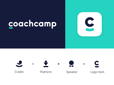
Take a look at our recent logo that we created for our friends from Coachcamp, an all encompassing platform aimed at personal trainers, nutritionists, insta bloggers, psychologists and business coaches. They want to take on all the pains of the coaches' routine, freeing up time for what is really important - coaching. And that’s precisely what we wanted to illustrate in their branding, no unnecessary flourishes, straightforward and easy to understand.
First of all we wanted to showcase that it’s a platform where coaches can grow without any worries about programming and design, and demonstrate that this platform has all the tools that they might need, hence the cradle metaphor. Add to that the image of a public speaker and you have the perfect portrait of the brand.
We also explored other directions before committing to this one, check them out and let us know if they work better in your opinion! 😊
┈┈┈┈┈
Looking for a design company? We would love to hear about your needs. Contact us: http://flatstudio.co/contact
┈┈┈┈┈
Flatstudio · Instagram · Facebook · Twitter
P.S. Follow us & Like 👍 this shot to share the love! 😍


