


Yosemite Finder Redesign

This is, instead, how I would have done it: since I quite like the decision Apple has made to put buttons inline with other elements of the toolbar (as seen for instance on the new Safari and Calendar apps), I asked myself why Apple hadn’t made the same changes inside the Finder.
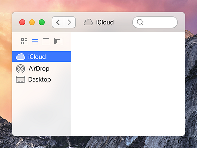
Here is my answer to that question: I decided to move the “view style button” to the sidebar in order to let other elements breathe.
I’m quite happy with the result, let me know what you think!


