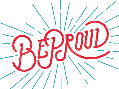
Be Proud
A work in progress for a shirt I'm doing. I love it in red and blue, but eventually it'll be green to follow the university brand.
Anyways, I'm looking for more consistency in balance and rhythm throughout the lettering. Perhaps the upper part of 'R' could use some tweaking?
View all tags
Posted on
Jun 4, 2014
More by Nick Ng View profile
Like


