Barrels & Backroads

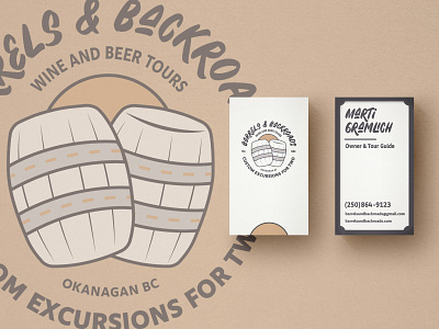
Local company was looking for a redesign on their logo and business cards for their wine and beer tours.
The logo is a play on the name, using the typical barrel hoops as roadways. The sun in-behind denotes the sunny, summer months in which these tours are popular in Okanagan BC. I chose the font as the A's reminded me of hills and the roads beneath them found in the valley.
Trying to achieve a clean, professional look, an off-white background and use of white space was used to create a minimalist look to the cards. I imagined these being put in a sleeve and that the empty space on the cards could be used to write out trip details, estimates or other information pertinent to potential clients.


