


Category & Tenure Selection Screen for Rentomojo


Continuing to the yesterday’s post.
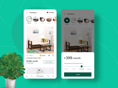
This is again part of the same project. Which I described in the previous shot. Where we achieved 68% conversion growth. If you havent checked it yet then its on Dribbble you can check it now.
We completely redesigned the product card to make it visually look really great and adding more information for the users to consume and take the right decision from here itself.
The idea was to show maximum information to the users in the category screen in subtle so that the card is informative and along with that it looks good as well.
For Eg: You can see image slider, Option to change the tenure in the category itself, add it to the wishlist and share the product detail to friends.


