Crooked Letter Creamery, II


Some additional lockups and marks for Crooked Letter Creamery!
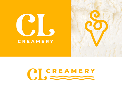
The ice cream cone mark was one of my favorite pieces of this project. It started out as a really simple and somewhat generic mark. My idea was for it to be used pretty sparingly just as a sub-mark but then Salem had a great idea to take it to the next level. She suggested we sneak an “S” into the mark to not only tie back to the name of the brand (Crooked Letter) but her name as well!
It went from being a supporting mark to something with a lot of meaning and subtle clues about the brand. A great example of collaboration at its best!
Let me know what you think! If you're interested in working together, my door is always open!


