Reveal Outline Icons

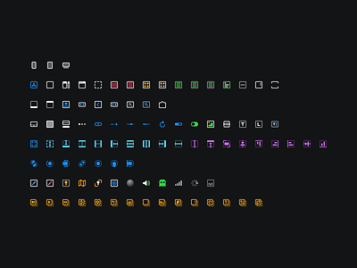
As a part of the macOS 11 redesign, Reveal's in-app icons have also been restyled to feel more at home on Big Sur.
This new set follows the same 1.5pt strokes, more rounded corners and overall "chunkier" look to match the new system-wide SF Symbols— but still stays true to the original design and metaphors established in the original set.
Another neat detail: these icons work equally well in greyscale. There's a setting inside the app that allows the user to toggle off (!) these multi-colour icons and tint them down to grey. The alpha values have been set in a way such that even similar-looking icons are different enough even when tinted down to a single colour.
The bonus part is that they look exceptionally great over the new vibrancy effects in macOS 11.
Have a look at them in action in Reveal: https://revealapp.com


