LIT branding and visual identity

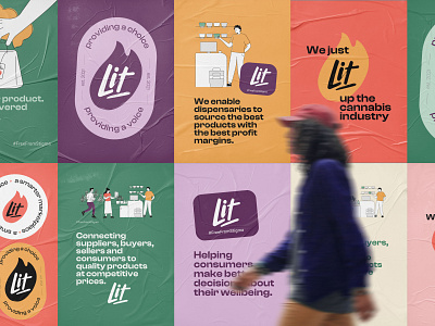


LIT works to connect businesses across the cannabis supply chain. The current process is fragmented and complex, LIT intends to change that by rebelling against current cannabis business processes and cannabis stigma. The brand needed to have wide appeal to target B2B and a large range of B2C users so the balance needed to be right for this as well as recreational and medicinal use.
The main logotype expresses a spark and energy that LIT wanted to bring to the industry. The main logomark is hand drawn and is designed work with and without its lit flame container. The look and feel needed to be rebellious, knowledgeable and authentic. I developed the visual brand with logos, colours and typography to fit in with these 3 core values.


